Typography in modern garment design has shifted from crowded multi-font compositions toward single, confident statements. By focusing on letterform proportion and micro-placement, independent creators are turning basic text into striking visual signatures.
Sizing Text for Architectural Impact
Placing typography across seam lines or along the upper spine breaks standard chest-print conventions. A high-density puff print font running vertically down a sleeve or across the collar collarbone creates movement across the body.
Kerning for Distance and Motion
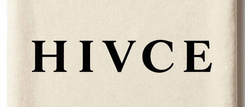
Extra-wide letter spacing works well for clean sans-serif titles, whereas tight tracking creates solid block silhouettes that read as unified shapes from across a room. Experimenting with extreme kerning lets simple brand names function as bold decorative graphic bars.
Combining Matte Inks with Tactile Finishes
Pairing ultra-matte black ink on tonal dark fabric with subtle high-gloss accent lettering introduces understated depth. This contrast encourages closer inspection without overwhelming the understated aesthetic of the garment.